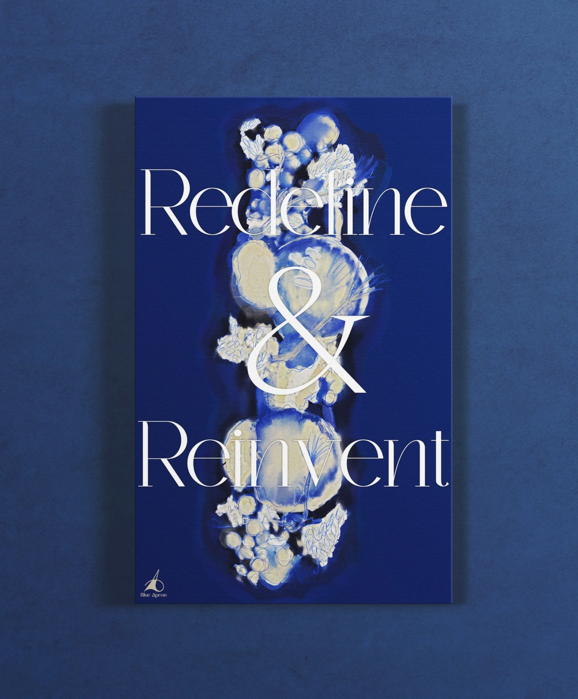
Blue Apron Rebrand
This rebranding encompassed lots of market research in order to create everything from logos, adverts, magazines, merchandise, and more.
-
Beginning with research I began my project with market research. Through user interviews and competitive analysis, I sought to rejuvenate Blue Apron with a more luxurious feel.
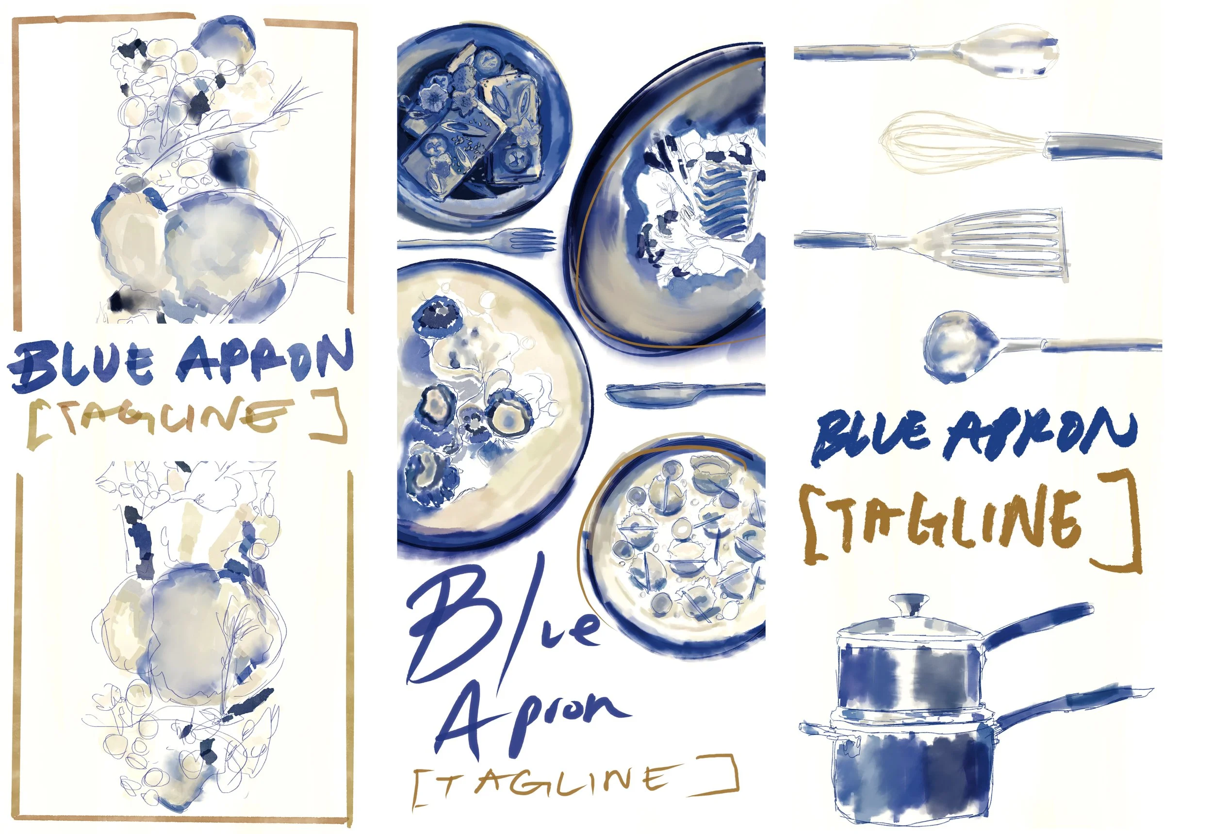
Logos began with 75 initial sketches and eventually narrowed to 3. The final logo was initially a monogram turned symbol.
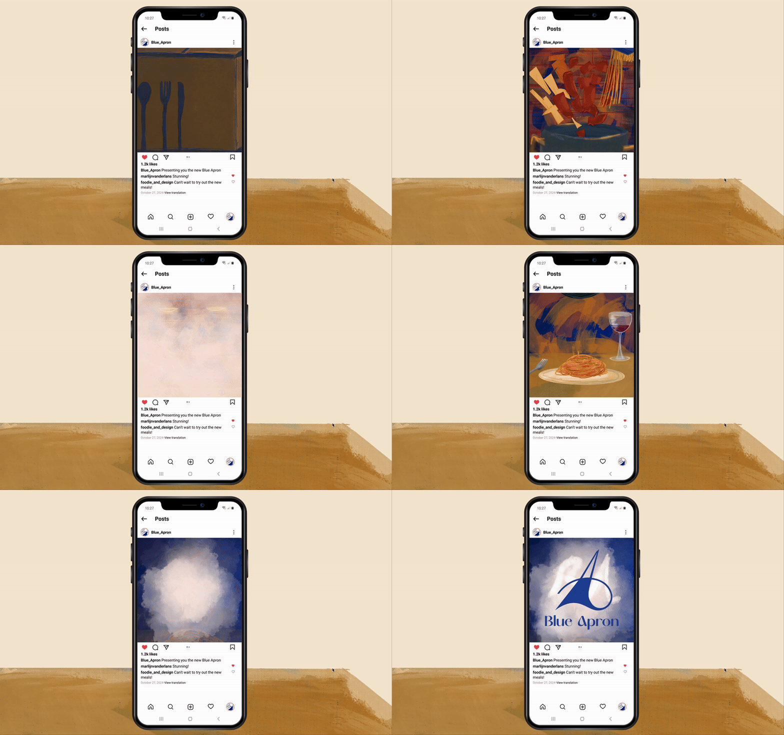
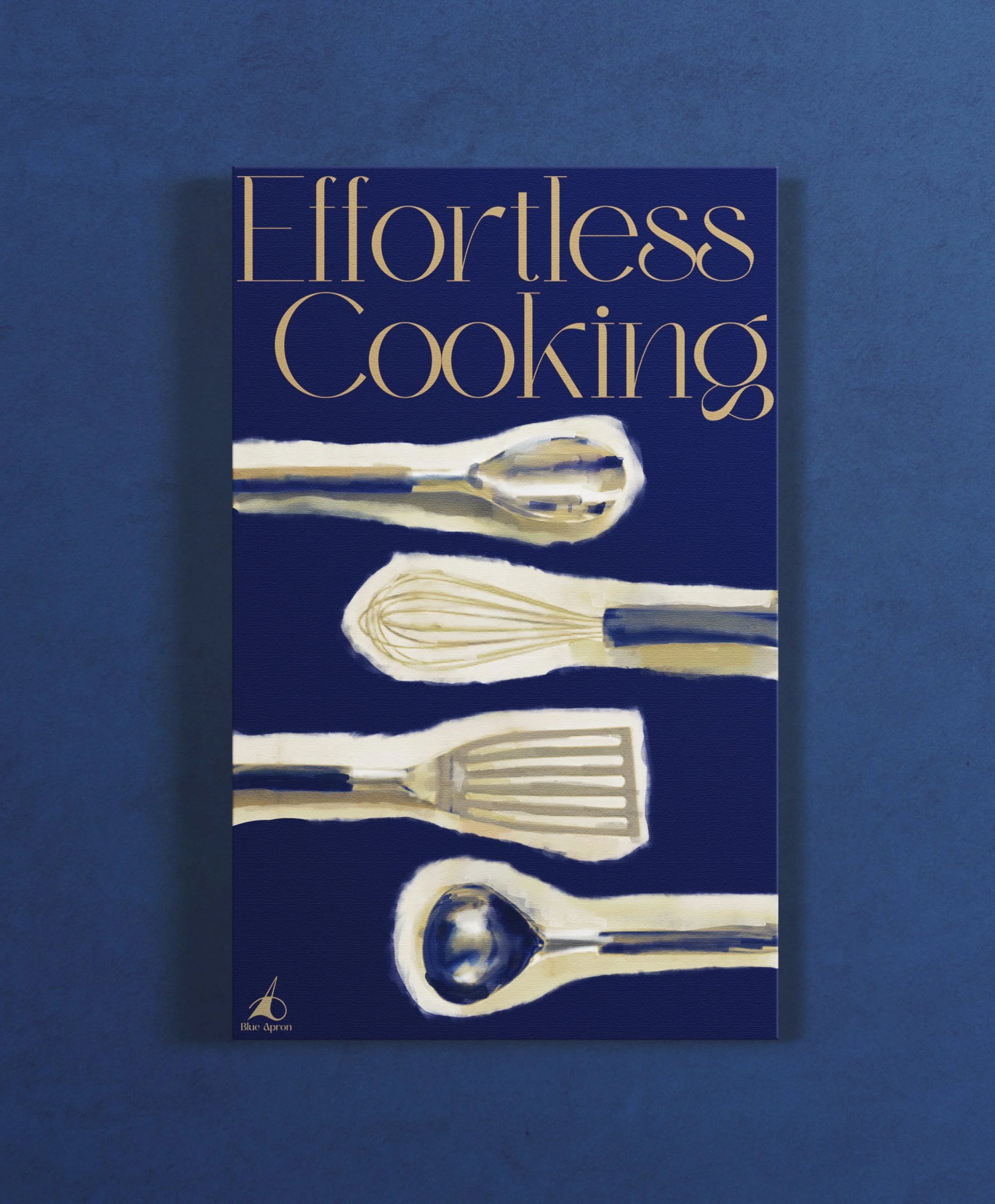
For adverts, I decided my 3 banners would be illustrative and balanced by a simple palette with modern type. The video plays more into the creative side of the rebrand by featuring a more illustrative animation.
Products were thoughtfully designed in relevance to what the company would offer after their rebrand. Photographs of meals are all works of my own.
The magazine is the final piece that showcases all work from this semester-long project. Keeping a clean and sophisticated look was my priority when it came to the type and layout.
-
Procreate, Illustrator, Photoshop, After Effects, Figma, Lightroom
-
Magazine: 8.5in x 11in
Video: 1080 × 1080px
Top (Left to Right): Blue Apron Banner sketches, storyboard for Instagram ad
Bottom: Magazine layout sketch
